
Creating the Moment: Designing My Hallmarked
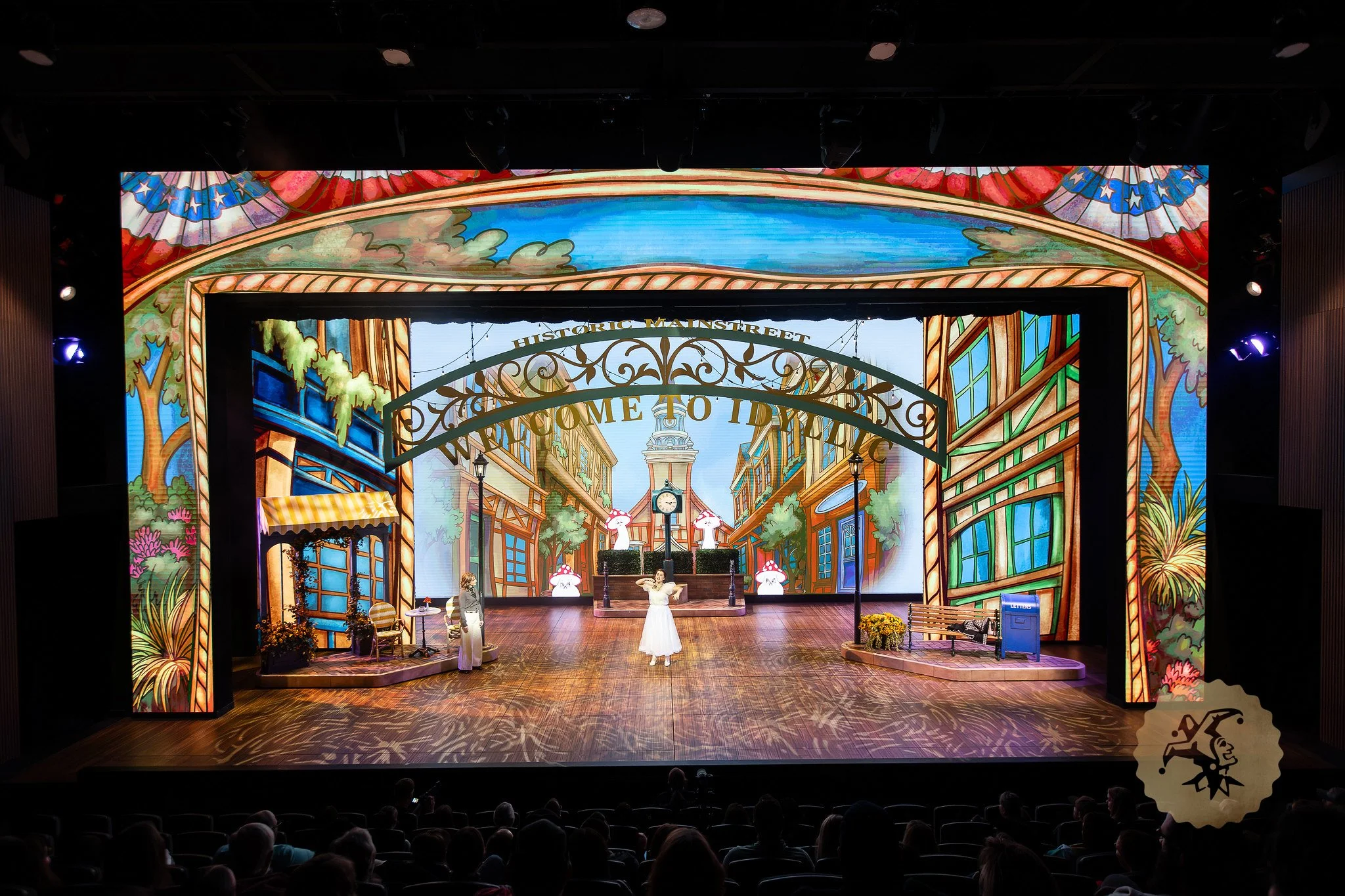
Hallmarked is the opening production on the new Beehive stage at the Mountain America Arts and Education Center. We have been building this for a few years, and one of the things I was charged with was designing the brand new LED screens. The proscenium itself is composed of screens with a 44 foot arch, with two 20 foot by 30 foot legs, and a 50 foot by 26 foot back wall. So we really needed to showcase what these screens could do while utilizing the show itself. So, in the show, the director, David Tinney, wanted to build a scene around taking a character into an animated world. As the Video Designer my thought was, what better scene for us to utilize these screens, than one that takes us into a cartoon daydream.
This sequence started with a clear idea from the first meeting: the world needed to shine. Not as a gradual shift, but as a clean transition from one set of rules to another. The show plays in a grounded, self-aware space up to that point, and then this number leans fully into the version of the world the character wants to be living in. The character has imagined herself in her own, perfect love story, and we wanted a world that would match that.
“My Hallmarked” is built as a satire that eventually stops being that and just brings the viewer joy.
It begins as a heightened take on a familiar kind of love song, something a little too polished, a little too idealized. As the music builds, the logic of the scene starts to stretch until it gives way entirely.
A wave of sparkles carries us through that transition, and from there everything operates differently.
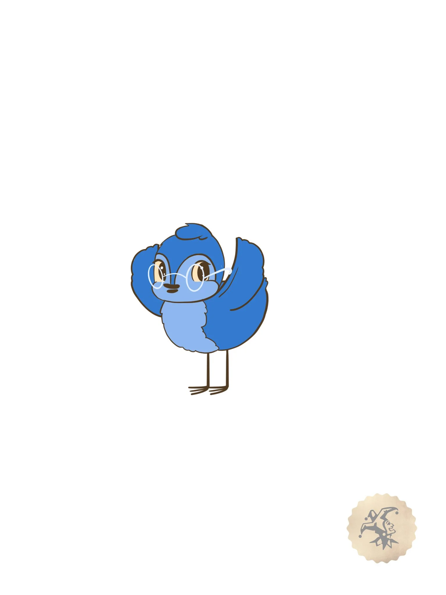
We started the process by building traditional woodland creature characters, we then used these to establish the style for the rest of the scene. The thumbnails were loose and fast, mostly focused on energy and behavior rather than design. How characters moved, how expressive they could be, how far things could stretch before it stopped feeling intentional. That phase did most of the heavy lifting. Once the tone and behavior were clear, the rest of the process became about refining and aligning.
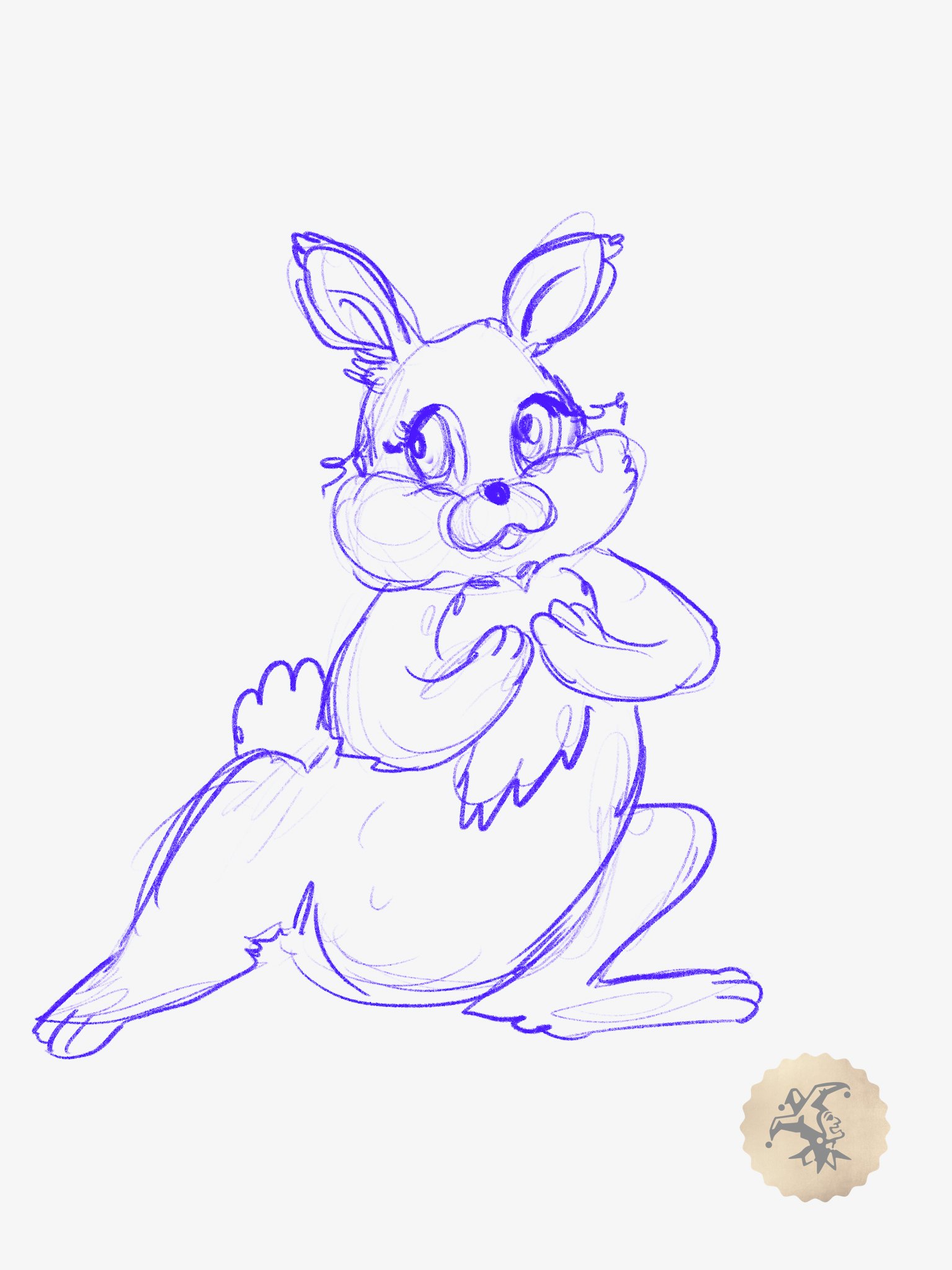
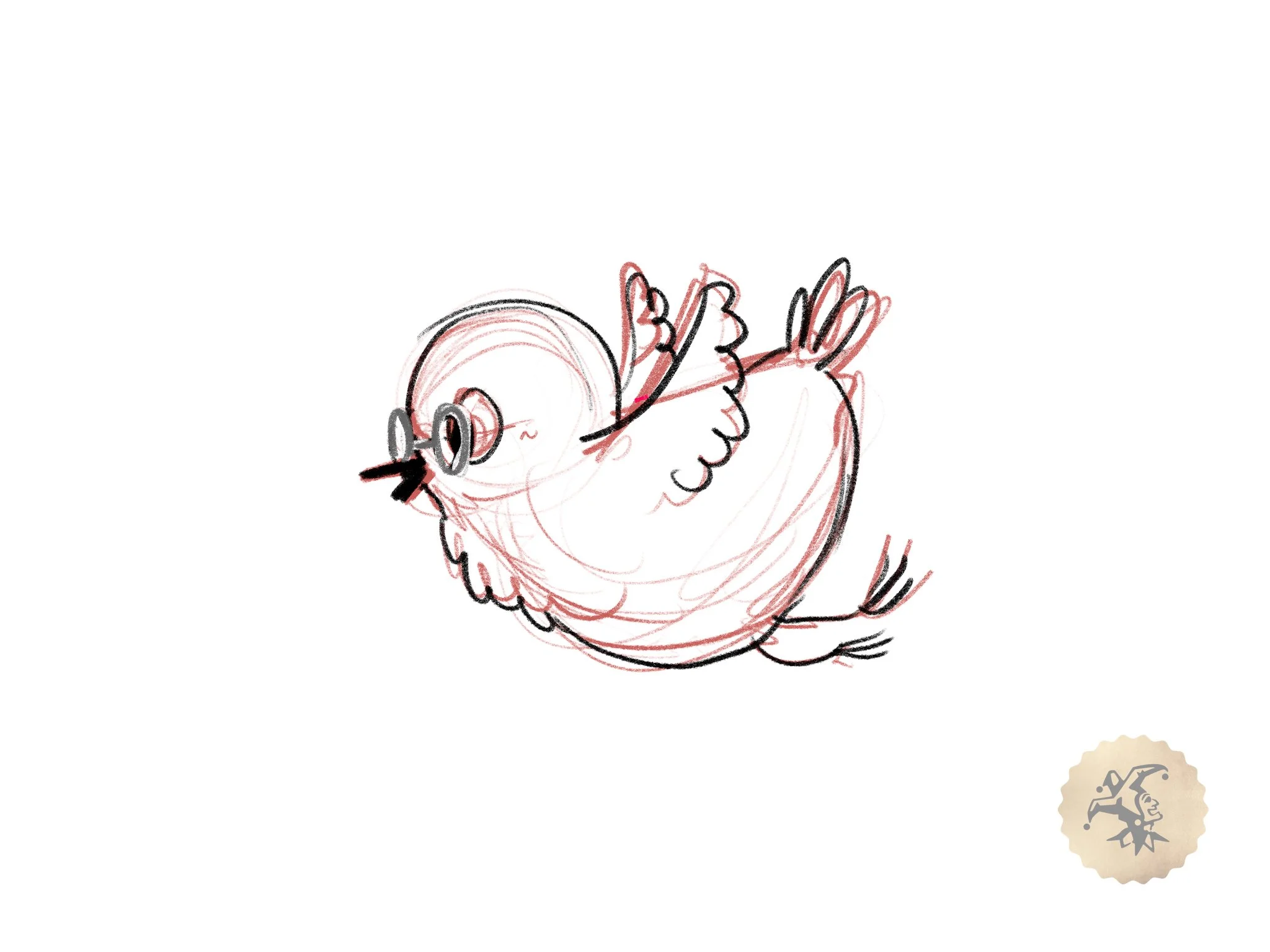
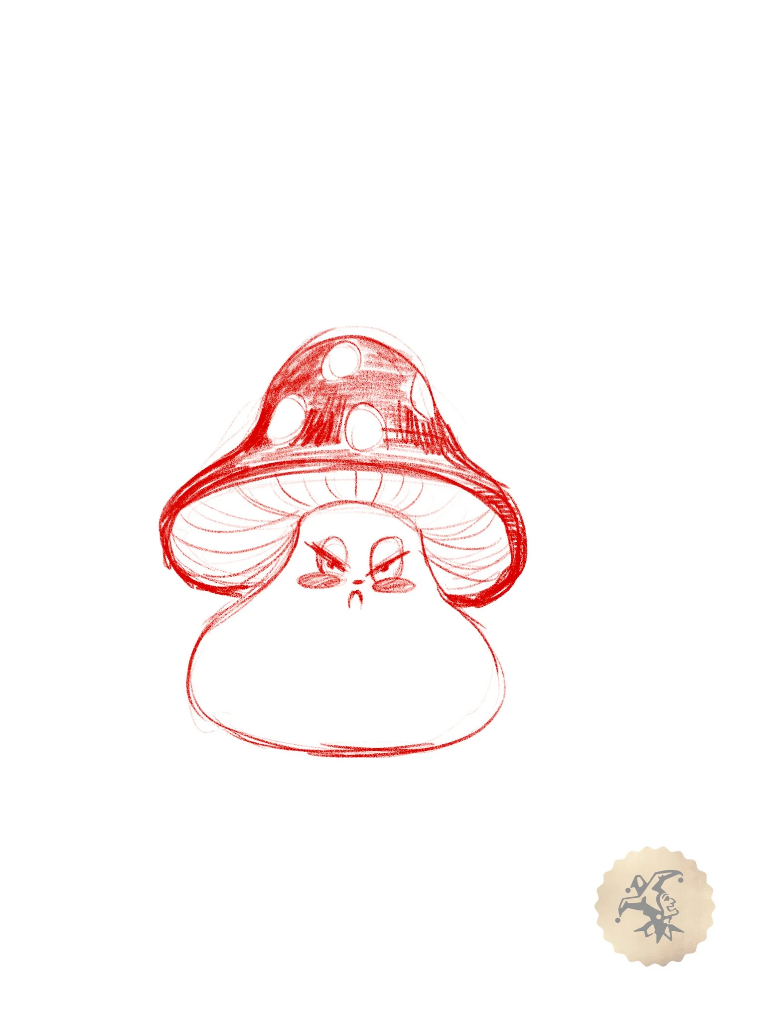
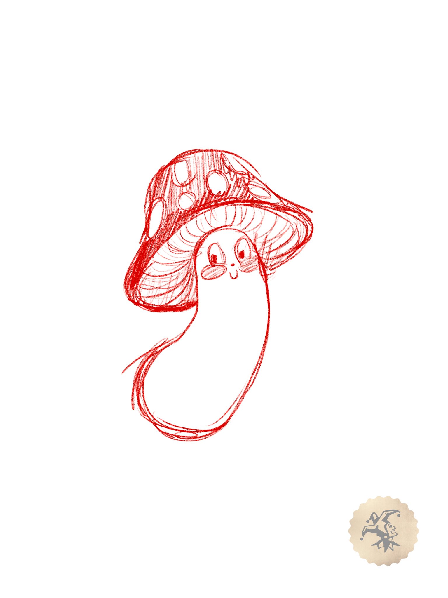
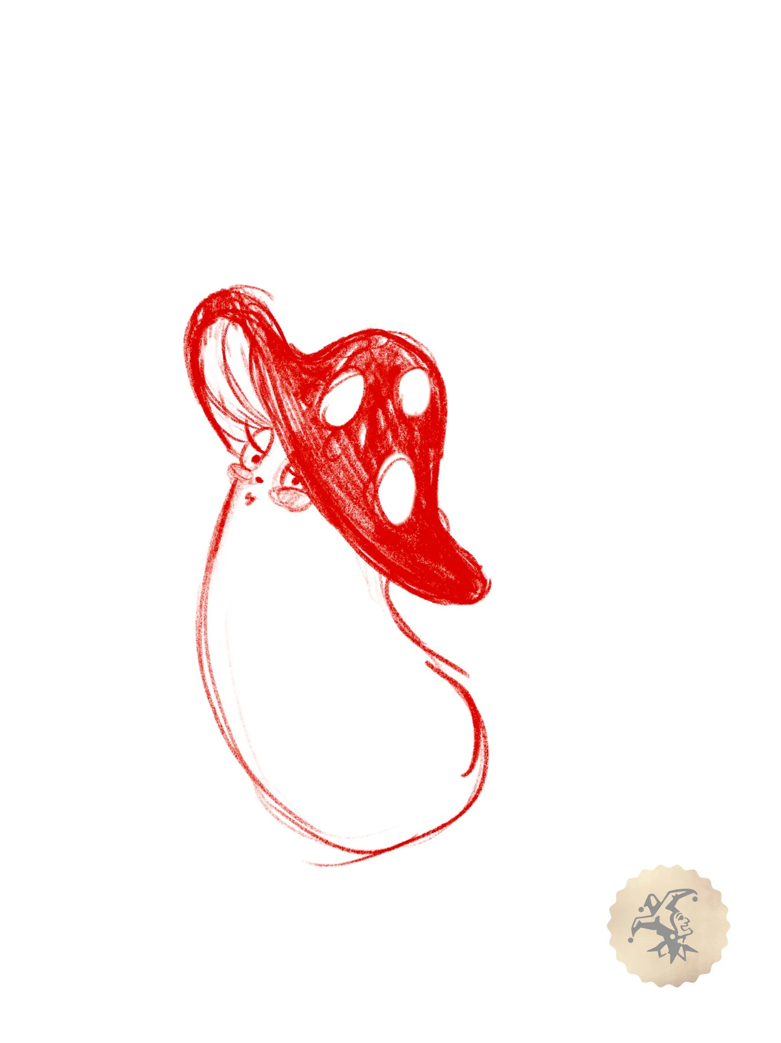
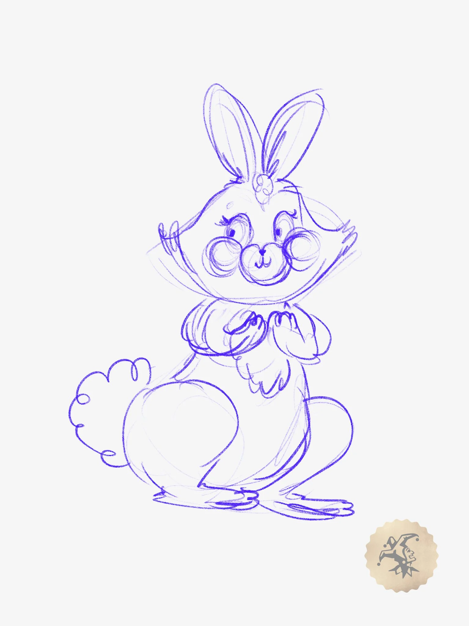
Initial Character Thumbnails- drawn by content creator Madeline Ashton
From there the work followed a familiar structure. Storyboards gave the sequence shape and let us track how it developed over time. We then created an animatic to keep the timing of the characters on the screen consistent with the blocking of the live characters so that they could interact with one another. By the time we brought in an animator, the sequence wasn’t an open question anymore, it was something that needed to be executed cleanly.
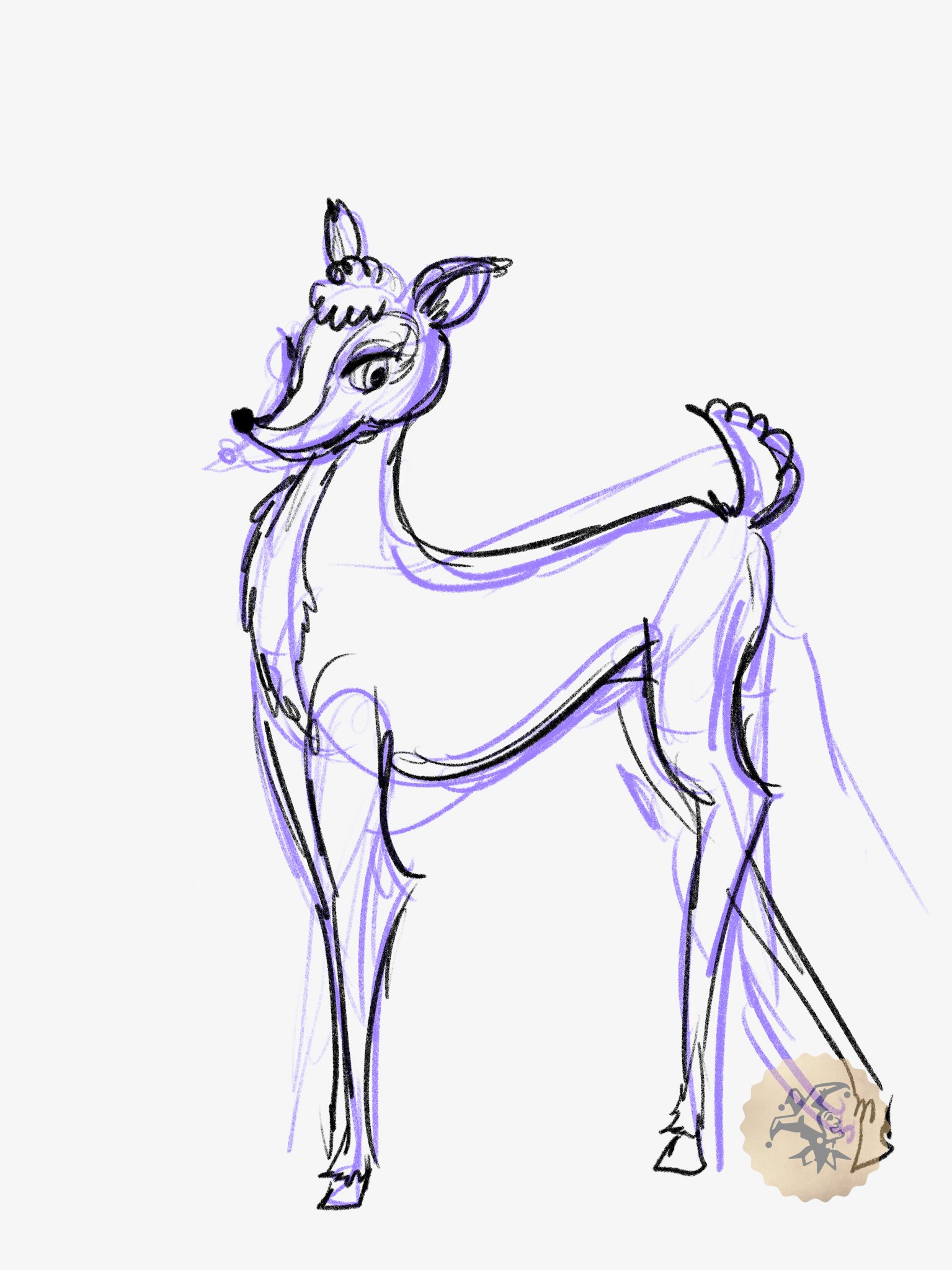
That development then moved in a clear progression. We started with thumbnails to find the energy and personality of the world, then pushed those ideas into an animatic where timing, pacing, and interaction with the performance could be worked out. From there, Madeline Ashton carried the work into full character design, defining the look and consistency of the world. Once that language was established, Erin Sims, from our in house video team, translated those designs into a format the animator could actually use, prepping and organizing the assets so they would hold up in motion. By the time it reached the animator, we were able to give them something that was more about execution instead of discovery.


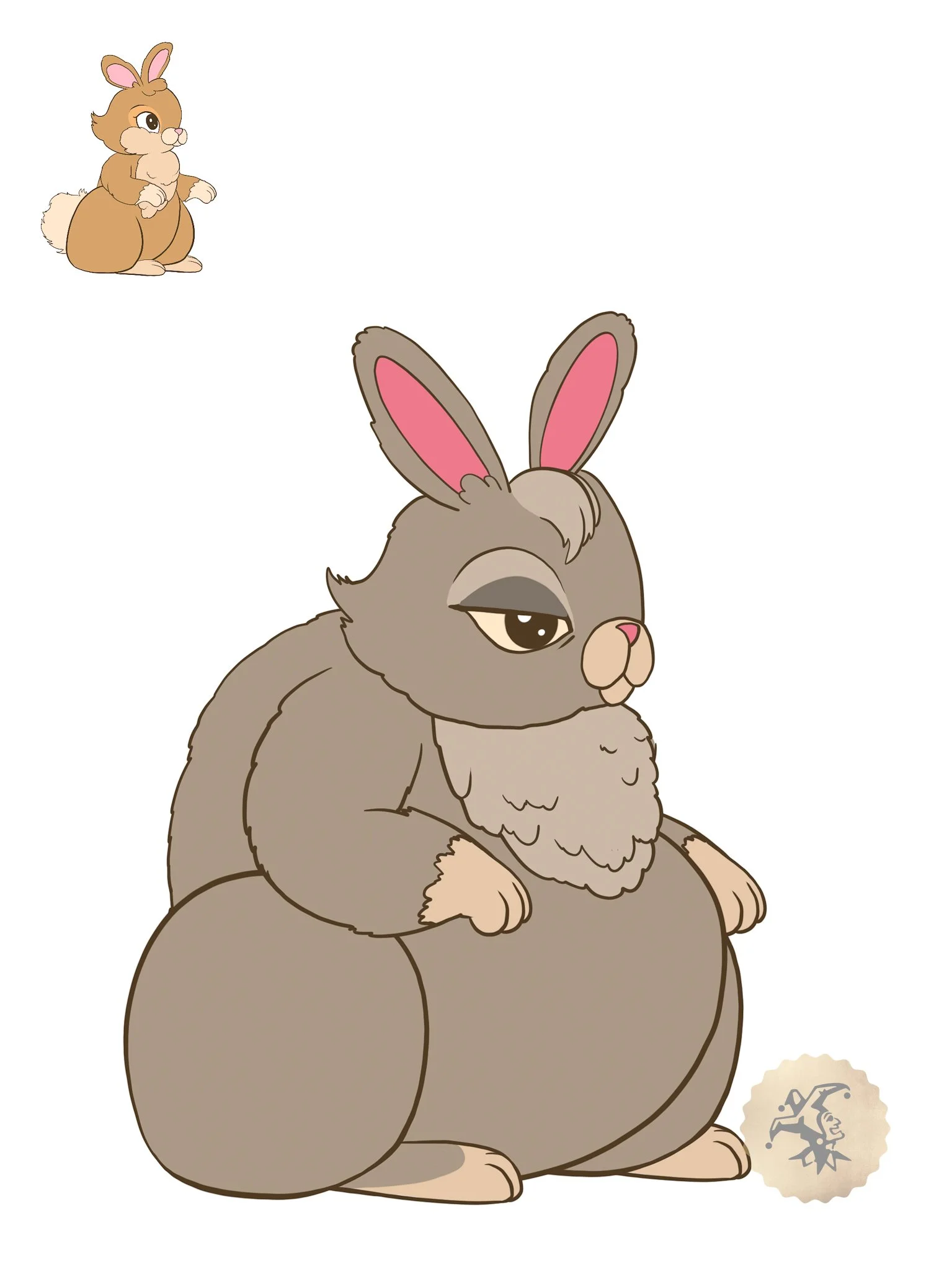
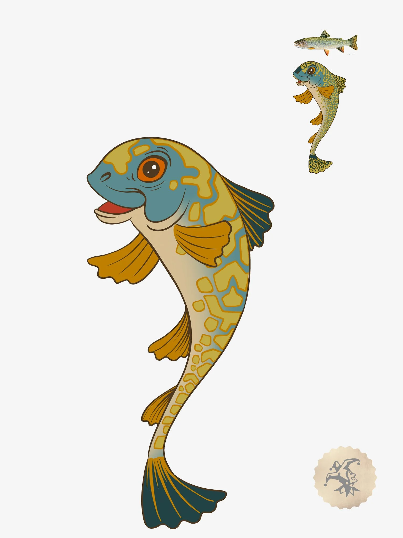

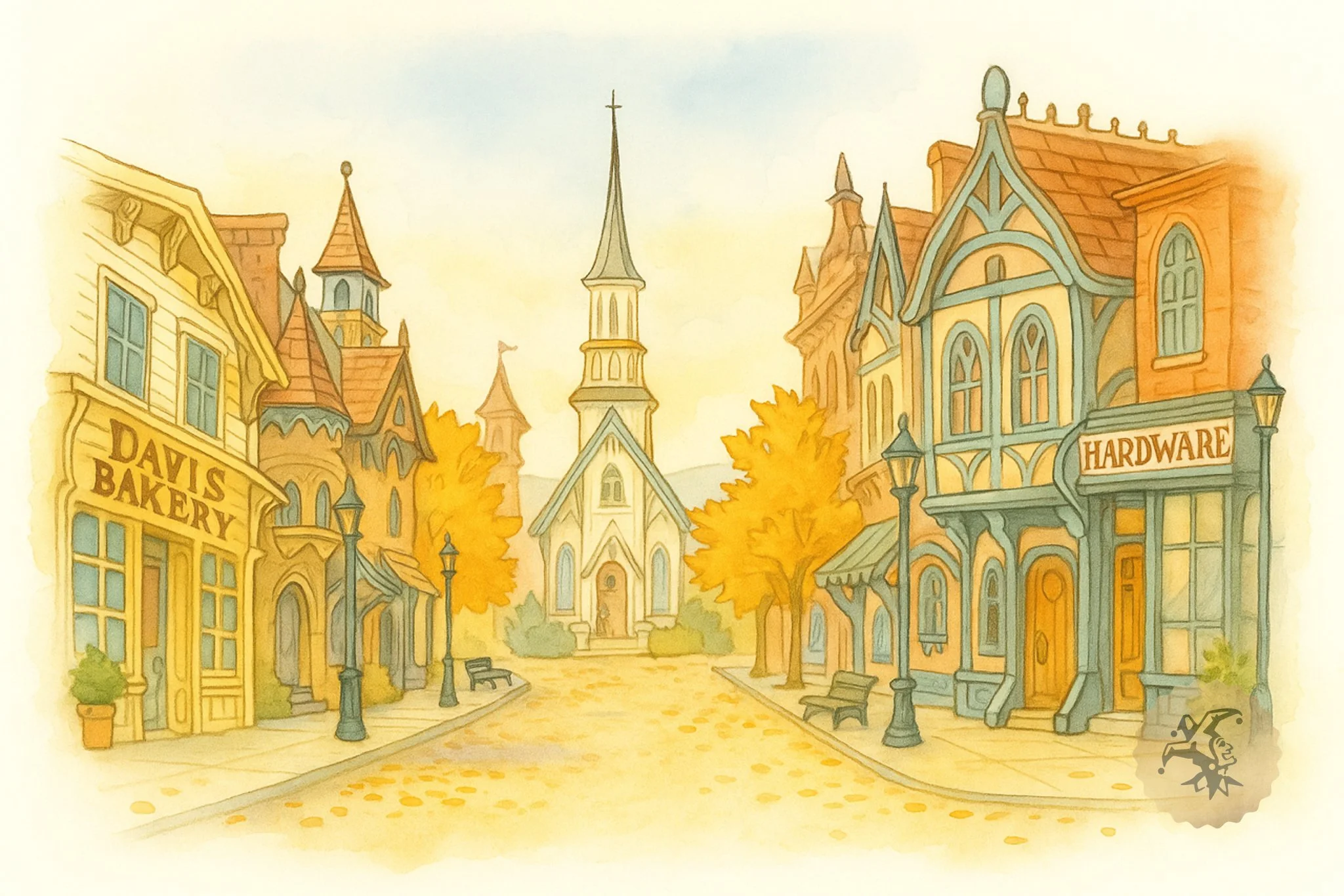
Character Design- drawn by content creator Madeline Ashton
The physical space also had to support that same shift. The proscenium, legs, and back wall were all treated as part of a single environment, not separate display surfaces. As the sequence opens up, the animation moves across those boundaries so the room changes with it instead of framing it.
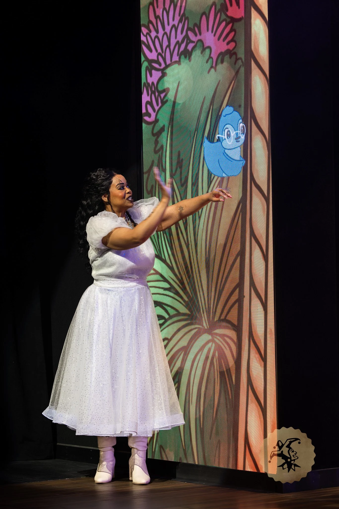
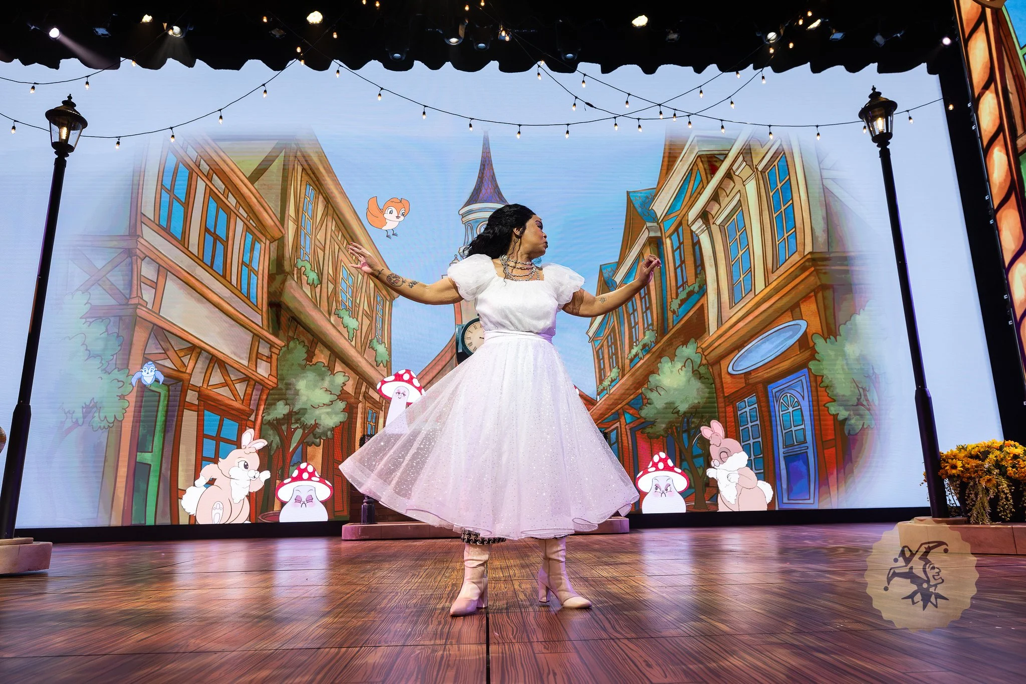
The scene begins with a dress reveal, signifying that the rules have changed, and everything that follows builds from that moment. Characters begin to appear, not as background elements but as active participants within the scene. Birds and butterflies float through the sky, smaller companions like rabbits and squirrels react to her presence, and the environment starts to feel magical. There’s a moment where a bird lands on her hand and she interacts with it. It’s a small moment, but it changes the way the audience views the scene from then on.. The animation isn’t just surrounding her, it’s engaging with her.
From there the sequence continues to expand.
Couples begin to dance through the scece, each one reflecting a different version of a fairy tale relationship. The environment opens up further, streets give way to water, and new elements take over without resetting the world. Fish and turtles move through the space as naturally as anything that came before, and the air fills with fireflies as the tone softens.
Each animated element exists as its own layer, which allows it to move freely across the entire system. Characters aren’t tied to a single surface, they can travel, interact, and land wherever they need to across the proscenium, legs, and back wall.
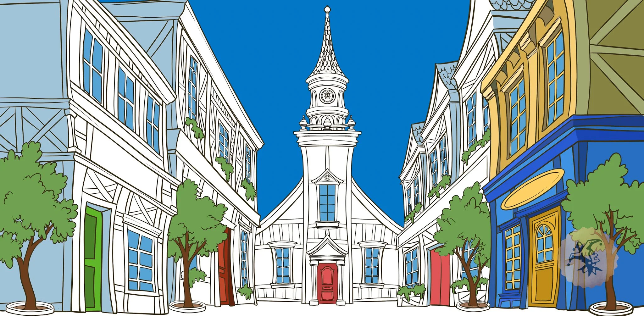
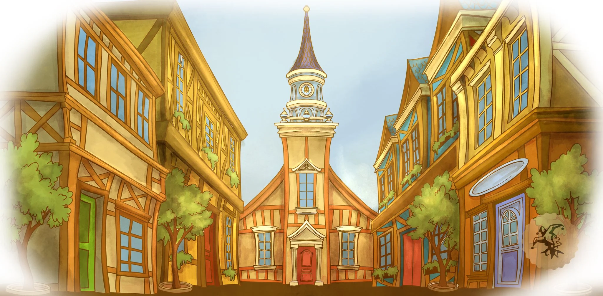
Animatic Vs Final Moment
The system runs across two Disguise gx2c servers, treating the room as a continuous canvas. Scale becomes less about individual screens and more about how the environment behaves as a whole. All of it is locked to timecode. That alignment is what allows the interaction to read as intentional. Working with Keaton Mangelson, the video programmer, we layered everything out, he mapped all the animals and animations individually to each screen. When something reacts or lands near a performer, it happens at the exact moment it needs to in the same location, every time. There isn’t any room for drift once the world starts behaving this way.
As the Video Designer, I worked very closely with Madeline Ashton on content creation, developing the visual language from those early thumbnails through final design. An animator was brought in to carry that work into motion and build out the full sequence.
A big part of my role focused on integration, aligning video and lighting so the environment tracked with the animation. Color, intensity, and timing all had to reinforce the same shift rather than competing with it. The sequence only works because it commits to the change. Once the world shifts, it stays there and continues to build on that logic. There isn’t a version of this where it pulls back or hedges the idea without losing what makes it effective.
From the first conversation through final execution, the direction stayed consistent. What changed was the level of clarity, how tightly everything connected, and how fully the room supported the idea.
By the time it reached performance, the goal was to let that world exist without explanation and trust the audience to follow it.
Altogether, I absolutely love this sequence. It is one of the most fun scenes in the show, and I enjoyed watching the audience as they witnessed the world come to life. After years of designing these screens, it was an absolute thrill watching them finally fulfill the vision.
Photos by Jaron Kent Hermansen, Leavitt Wells, Hale Centre Theatre
Edited by Kurtis Blackburn
Disclaimer: The views and reflections shared in this post are my own and are based on my personal creative process. While I’m proud to be an employee of Hale Centre Theatre and a member of the incredible collaborative team behind this production, these thoughts do not represent the official views of the organization. I believe deeply in the power of collaboration, and I gratefully acknowledge the many artists, technicians, and storytellers whose work brought this show to life.
Click below to view the digital program for this production